
- Mobile-First Design: Essential Tips for a Smooth User Experience
- Understand Your Audience
- Prioritize Simple Navigation
- Optimize Loading Speed
- Focus on Visual Hierarchy
- Use Responsive Design Principles
- Optimize Touch Targets
- Incorporate User-Friendly Forms
- Test, Test, and Test Again
- Leverage Mobile-Specific Features
- Conclusion
Mobile-First Design: Essential Tips for a Smooth User Experience
In today’s world of bits and bytes, smartphones stand out as the key point to accessing the internet among most customers. As per the Statista 2023 report, more than 6.9 billion individuals across the globe possess mobile devices. This trend highlights the need for mobile-first designs that emphasize developing applications for smaller screens that are handheld devices. Hence, businesspersons, developers, and designers have to consider ways to design websites and applications while concentrating on how they will feel when accessed through phones. Here are some tips on seamlessness, efficiency, and user-friendliness in carrying out a mobile-first design.
Understand Your Audience
 It’s necessary to identify your target before delving into specifics regarding mobile-first design. Because different people use mobile websites for different purposes, it could be simple for a user to become confused on your page due to their needs, preferences, or usage patterns. In order to determine which mobile device types target audiences would like, how long they typically spend online on their phones, and what features of a website or application are most important to them, thorough research must be done. In this regard, it is easier for people to use and truly enjoy your design more conveniently when it is in line with their schedule.
Prioritize Simple Navigation
 The mobile user experience depends greatly on effective navigation. Since mobile screens are small and users interact with them mainly through their fingers, complicated or messy menus can frustrate users. Therefore, it’s important to design navigation options that are simple, intuitive, and easy to find. To start, simplify your navigation bar so that important items can be accessed without overwhelming the user. One approach is to use drop-down or sliding menus, also known as hamburger menus, that can easily condense all your options into one place. Moreover, make sure that buttons and links are large enough for easy tapping and always include visual representations like icons.
Optimize Loading Speed
 The speed at which a website or application loads on mobile devices is a critical factor to consider while optimizing. Because the majority of mobile users are constantly on the go, a website or application that loads slowly may see a decrease in engagement and an increase in bounce rates. According to Google, 53 percent of mobile users abandon websites that take more than three seconds to appear. Therefore, emphasizing speed should be one of your main focuses when creating designs targeted at mobile-first audiences. Several factors can impact load speed including the size of images used, unnecessary scripts, and too many elements included in one page. To enhance performance; consider reducing image sizes without compromising quality, applying minified CSS and JavaScript. Also, use browser caching so as to reduce server loading time.
Focus on Visual Hierarchy
 Because there is a limited screen space, it’s significant to emphasize content in such a way that it becomes eye-catching. A good visual hierarchy lets users see important things first and know how the content is organized. When designing for mobile devices first, this hierarchy must be functional as well as pleasant-looking.
The first thing to do is minimize text on the screen and use big font sizes for headings or titles. This can also be achieved by using subheadings and bullet points which create chunks of information that enhance reading ability. Clarity can be improved through the use of negative spaces, which are commonly known as white spaces, making the text less dense. Further, keeping visible key elements like CTAs helps steer people toward what is to be done next.
Use Responsive Design Principles
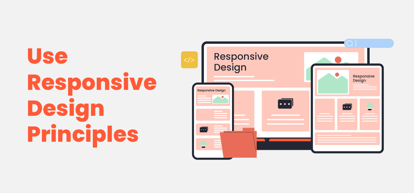 While mobile-first design focuses on smaller devices, it is equally important to ensure that your website or application can fit all screens perfectly including tablet as well as Desktop screens. The answer lies within responsive design principles whereby you make a layout that changes based on what type of device a user has in their hands at any given time, and thus ensuring a consistent experience across various devices when accessing your content.Adapting your design to multiple screen sizes using scalable grid layouts and media queries is appropriate. Start with a mobile experience then move to bigger devices. When designing, avoid fixed-width components since they can interfere with the flow of your content when users change from one screen size to another.
Optimize Touch Targets
 In order to enhance the touch experience, mobile-first websites should include interactive elements like buttons, links, and forms. When small buttons are crammed together, there is an increased chance for mis-clicks that may leave users feeling frustrated and disappointed by their usage.
According to Apple’s Human Interface Guidelines, control targets for touch should have a minimum size of 44 x 44 points while Google’s Material Design suggests a minimum of 48 x 48 dp (density-independent pixels). Additionally, you need to leave enough space between interactive elements so that people do not click anything accidentally. To indicate that something can be clicked on, it is beneficial to provide hover effect feedback which enhances usability.
Incorporate User-Friendly Forms
 Forms are important parts of sites as well as applications; however, they can be somewhat difficult when it comes to mobile devices due to limited screen size and the challenges posed by typing on small keyboards which may not always be easy. Therefore, to enhance mobile-optimized user experience (UX), there is a need for simplifying forms by limiting their fields and steps taken during filling in such forms so that dropdown list boxes, check boxes and auto-complete can reduce manual inputs.
When creating forms for mobile devices, make sure they are optimized for mobile use. This includes implementing features like auto-filling and providing keyboards with specific mobile-friendly options, such as numeric keys for entering phone numbers. Avoid presenting users with long and complex forms. Instead, break the forms into smaller parts or only reveal additional fields gradually when necessary.
Test, Test, and Test Again
 The groundwork of every flourishing UI/UX design approach is usability testing. Through testing it becomes possible to uncover possible problems and areas that need improvement thus ensuring that the mobile-first design meets its expectations on different devices and platforms. Use A/B testing strategies to find out if certain designs are functional or not. Also, ask people for feedback so you can know their issues.
Generally speaking, regular usability testing is crucial because mobile technology and user behavior keep changing. Something that might be relevant today may not be tomorrow; therefore, design adjustments based on real-time information need to take place at all times for a seamless mobile experience.
Leverage Mobile-Specific Features
 Remember to utilize mobile-specific features such as geolocation, camera access, and push notifications to enhance the overall user experience. These features are not available in desktop experiences, and they can greatly improve interactions. For instance, allowing users to take snapshots of documents using their phone’s camera or automatically filling in their location through GPS can make interactions much more convenient. However, it’s important to be cautious and not overwhelm users with unwanted permissions or intrusive features, as these can negatively impact user satisfaction and trust.
Conclusion
There is no reason why mobile-first design must not form part of your process. To create a user-friendly site for mobile devices that will satisfy the demands of modern digital users, one can use simple tips like optimizing navigation, enhancing loading speed, using responsive design, and carrying out regular usability testing exercises. When done properly, this type of architecture enhances satisfaction among users – which subsequently leads to increased involvement rates and conversions – thus benefiting both parties involved.
Get an audit done for your website by emailing us at [email protected]


Subscribe to our Newsletter
Stay up to date with our latest news and products